Woodhorn Museum (Entry Charges Apply)
Saturday 14th February – Sunday 10th May 2026
The Northumberland Open Exhibition is a large scale art exhibition which takes place at Woodhorn Museum, Ashington and occurs annually in the late winter to early spring. The huge selection of art displayed in this exhibition is created by local artists in all different stages of their artistic careers. This year, as always there has been some exceptional artwork submitted for display within the exhibition, and as usual most pieces are offered up for sale. As with previous years when I visit this particular exhibition, I do so without knowing what artwork is being exhibited, or which artists are taking part. There is always a feeling of awe at the sheer quantity of talent on display here, yet this event barely scratches the surface of the Northumbrian arts scene.
As always at Woodhorn, I was greeted with a nice smile and offered an information sheet, which I would require to get the most out of my viewing of the exhibition. I visited the day after the exhibition opened for the year as I like to get in there fast for my first look and then pop back a few times to review the exhibition before it disappears from view, or makes it’s way into private collections. This year, because of the sheer quantity of artworks (568 different works), it was difficult to pick my favourite pieces. However, managed, and have decided which pieces I really liked and would like to showcase here. The artworks which I have selected as my favourites haven’t been chosen through my personal stylistic preference, but more by whether they spoke to me, or engaged my interest in a different way to usual.
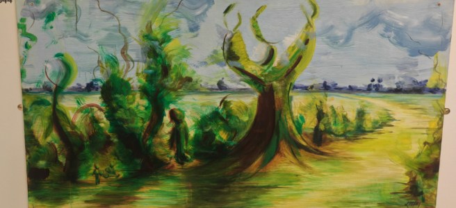
The Artwork I liked the most: Lara McFarland – People as the Trees and the Trees as the People
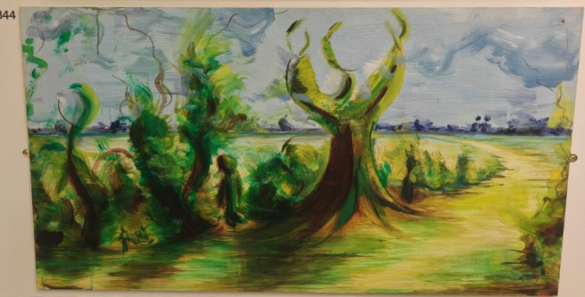
So, anyone who knows me knows that I have a preference for a particular type of artwork; and that this particular piece of art really does not fit that cosy little niche which I find aesthetically appealing. However, this artwork piqued my attention when I saw it and I’m still not certain what about it drew me in. It has a quite limited colour pallete, relying on green’s and browns and greys to give depth to the picture, and tonality to help build depth within the picture. While the painted structure of her artwork isn’t finely delineated, and has huge, obvious brushstrokes, I feel that they manage to enhance the viewing experience here rather than detract from it.
This scene with which we are presented with appears as though it is in fluid motion, with very little of what is presented to the viewer as static objects within the picture. This sense of motion functions well right throughout the image, giving as much life to the background and clouds as it does to the foreground elements within the composition.
That anyone could come up with the concept of switching the people with the trees within their artwork is a whole new idea to me, and Lara has done a fantastic job here of representing this alternate world view. Deep within the hedgerow, sometimes hidden, sometimes not, the greenery has assumed the shape and persona of people; whilst at the same time, that large looking tree in the centre right of the foreground is surprisingly human in feeling and in bearing. For me, this artwork brings out a sense of wonder, and evokes an other worldly feeling that inst brought about through many artworks at all, and for that reason, People as the Trees and the Trees as People is that artwork which I personally found most interesting and engaging in this exhibition.
Ruth Craig Murphy – Hares Under the Winter Moon
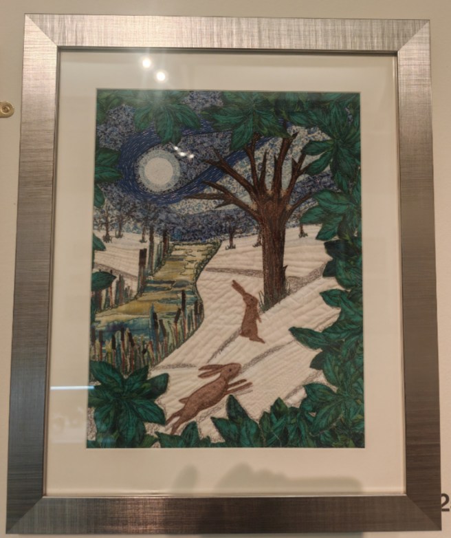
Ruth’s artwork, Hares Under The Winter Moon really appealed to me because the form and subject matter of the picture reminded me of a couple of paintings that I really like. The way the hares are positioned within the frame, and the bearing of them gave me the distinct impression of the men in Breughel’s painting Winter Hunters; whilst the arrangement of patterning in the sky gives the distinct impression of being influenced by Edvard Munch’s Scream. As this picture contains similar pictorial aspects to both of those paintings, it stood right out to me as a fantastic and intriguing piece of art.
At first I didn’t realise that this was a piece of textile art as from a distance it looked like a painting, but close up, you can hoe this piece has been assembled. A lot of the different lines of thread throughout this artwork look as though they have been created using freehand stitching as opposed to sticking with the rigidity of machine sewing with the textiles under the foot. I think the leafy green border around the scene really helps accentuate both the distance and spacial recession inside of the picture space itself.
The manner of construction of the artworks sky, utilising differing textiles with quite different patterns and completely different looking textures adds a real depth to this work. It appears as though a moon is enveloped within a cloud, in a sky which has dark patches but the swirly fog-like etheriality adds gracefully to its mystique. The river leading up to that sky, in its own way transforms the entire context of the image from a close up scene of hares playing in a forest glade, to a full landscape with all of the depth and complexity which you would expect from a photograph.
Jane Fitzpatrick – Newbiggin By The Sea: Shared Light
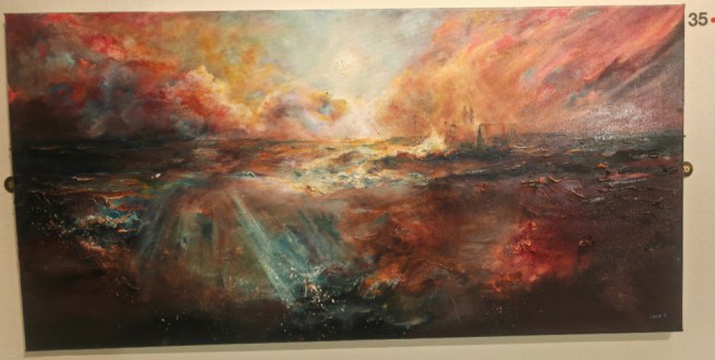
Upon my first look, I almost overlooked this painting. It took a few minutes of actually looking into the image to see what an absolute marvel it is. The colours are magnificent, the reds of the clouds in the sky, reflected within the water appear are quite realistically dulled. There is a good horizon line in there which the eyes are naturally drawn to, before resting on the two figures out at sea.
Those figures are the ones from the iconic statue of a couple placed just out in the bay where they have the best view of the sunrise. Seeing them there, standing firm against the growing light, with whatever weather those clouds are pushing in, you can get a real sense of the scale of the scene, and of the majesty of the sunrise itself.
Sylvia Brown – New Hope At Sycamore Gap
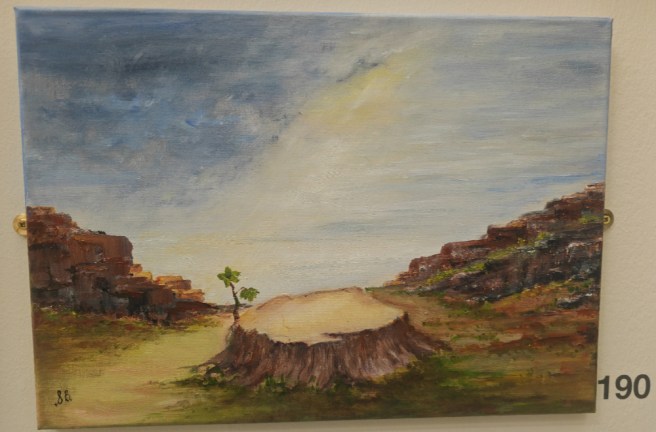
Sylvia has taken a leap of faith here, and created an artwork which we all needed to see, as its time we looked to the future of this space, and stop dwelling so much on its past. She has taken the stump of the old, felled tree at Sycamore Gap, which was cut down almost three years ago now, and she has painted it as it begins the next cycle of it’s life, regrowth. The regrowth of the tree appears to take place at the edge of a stage, created by the flat platform of the stump in an amphitheatre, created by the wall descending the hills. It is fitting then that this image doesn’t feel as though it’s just about the tree, it feels as though this painting is about the Icon, and the rebirth and regeneration that everyone seeks.
This small, unassuming watercolour painting which is gracing the far end wall of the gallery space manages to bring hope for the future through the regeneration of the beloved tree at Sycamore Gap. The single shaft of light flowing diagonally through the picture space brightens up the stump with it’s leafy growth, demonstrating for ll to see, that unlike the barrenness of the landscape, or the ruin of the ancient Roman wall, it is still alive, and growing, and relevant; and that it will remain steadfast into the future.
Amanda Hall-Younger – Soliloquy of the senses 1-3 (Breath, Witness, Echo)
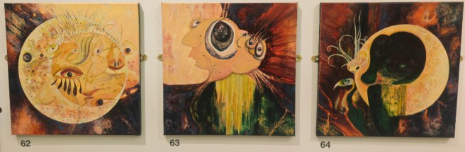
I feel that I must include, and treat these three artworks as a set as they feel as though they belong together. They are really interesting and different they a very individualistic feel about them. They are relatively small, quite low on the wall, low enough that I think a lot of people may overlook them. However they have an odd complexity in their abstractness, they draw in the eyes and force them to look ever closer and to seek out new details and hidden meanings within. The colour pallete from which they have been produced is relatively narrow, containing different shades of beige, yellows and reds for the most part.
The three images which Amanda has placed into this exhibition work fantastically together as a set, however each image also has enough depth and character of feeling to stand on its own if required to do so. I love that this is a conceptual piece where different aspects of senses are portrayed in their own way, differently from the others, but still close enough in style that it can be seen as a different aspect of similar feelings. It is always an interesting, and unique thing to be invied to see how an artist visualises different feelings or senses as these expressions are as personal as the experience itself.
Geoff Hudson – Dreamscape
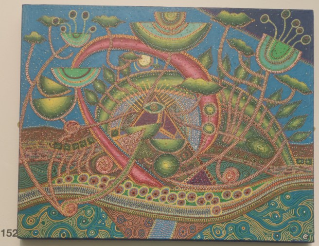
This colourful and vibrant offering by Geoff Hudson, called Dreamscape stands out well from the other artworks on the wall. It is a fantastical image in itself, beautifully abstract and eye catching, the colour, pointillism and intense patterning which the artist has used has really elevated this painting to another level, making it stand out from the crowd.
To my eye, this appears part plant, part landscape, part single celled organism, and part geometric and swirly patterns. All of these different apparent aspects of this work function really well together as a cohesive whole, with no line, or allusion to texture feeling out of place here. This is a wonderful, and beautiful piece of artwork which is an absolute delight to look at!
Sue Andrew – Monday, Sweet Monday
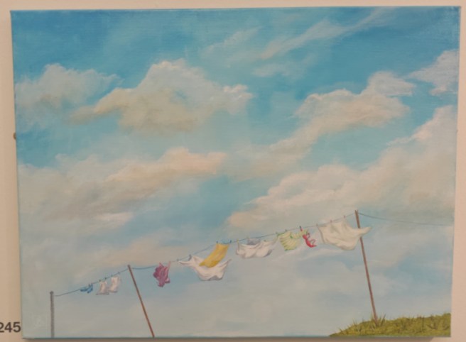
When spotted this painting, I thought that it was delightfully whimsical with its bright light airy feel. The scene of washing drying on a line is as ubiquitous a scene in the north of England as you can imagine, this could be any garden, anywhere within the region. What has really piqued my interest here isn’t the assortment of laundry on the line, but the slightly odd, quirky angle of view which we are presented within the picture space. We are looking up towards the sky, with only part of the washing line poles within the space and the tiniest patch of grass with which the entire frame is anchored.
This oblique angle gives us a chance to glance over the laundry as it flutters in the slight breeze, and allows us to rest our eyes on that masterfully produced sky. The sky contains a good range of white and blue tones, where the interplay of light and colour make a very realistic rendering of the usual cloudscape that appears overhead whenever laundry is drying. This picture is nice, slightly odd, but at the same time reassuringly familiar and homely in its content and context.
Hannah Forsyth – Storm Passing
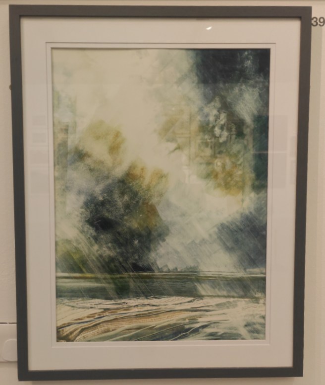
This nice little print by Hannah Forsyth intrigued me enough than I have included it here. It’s appearance, that of a flat landscape, or seascape with billowing clouds and slanting heavy rain really captivated me and drew in my imagination. There is something etherial here in the monotype design here which really captures the essence of that rain and displays it in such an easily interpretable, emotive sense. There is a feeling in the sky here of depth and grandeur, the cloudscape that she has produced hints at being a part of a grand vista, and not merely the edge of an approaching storm.
The artist has also utilised a limited colour scheme, browns, blacks and green dominate the image in loose open forms, only coalescing into something more recognisable along the bottom of the print where they resolve into the rocky foreshore of a coastline. This feeling of being at the edge helps to add some extra depth and feeling to this print. Hannah’s own website states that she fell in love with printmaking and the aspects of creation it allowed her to work with, and this love shows through clearly in this wonderfully created print.
George Lowrey – Tyne Bridge 1771
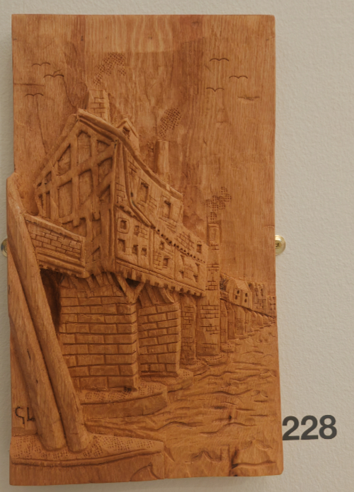
This carving of the Tyne Bridge by George Lowrey has been beautifully created using Ash wood. In the exhibition space, it is right on the edge of a display, at the edge of a wall and is in a position to be easily missed as the eye tends to slide past this area and focus on what is beyond. I find that the red colouring of the wood gives it a subtle warmth and has a similar colouring to that of Terracotta. The old Tyne Bridge which he has beautifully carved here isn’t the early twentieth century bridge that everyone knows and loves these days, but is an earlier bridge which sat where the modern day Swing Bridge is currently located.
The bridge itself is quite cleverly rendered, George has used a decent amount of foreshortening in the arrangement of structures that sit along the bridge, as well as using a linear perspective to reduce the size of these buildings the further away they are intended to appear from the viewer. The end result is good, the bridge sitting on its many piers with buildings right along the bridge deck has a realistic identity in the third dimension, even though it has been mostly carved in a shallow relief. The end wall of the closest structure has a sturdy and believable architectural build, those beams weren’t just for decoration. The smoke coming from the chimneys on the buildings and the birds in flight in the sky work well alongside the water to bring a sense of life to the whole scene and make it appear less static. The arches of the bridge can be clearly seen, and in fact, there is a remaining arch from this old bridge left in situ beside the swing bridge today. This is a charming carving, and I have included it here because it stands out in this exhibition as a fantastic piece of wood carving.
Pamela Brown – Nature Obsessed Number 2
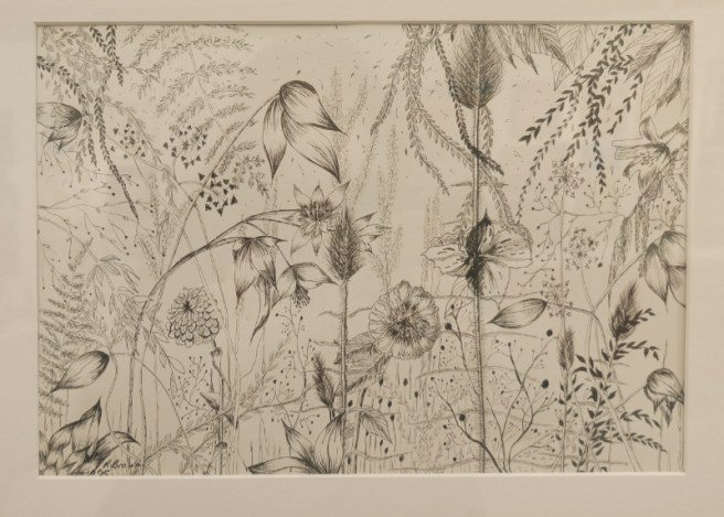
Pamela brown’s graphic arts drawing is a nice assortment of grasses, flowers and plants all arranged on the page so that they are interlaced, and that they work well with the form of each other to help emphasise and identify the plants beside it. That this is a flat picture with little to me recession into the space really appeals to me; it means that here is little that can hide in there, in the picture space. While each of the different plants involved here are all really finely delineated, they are all drawn in at differing scales. This slight imbalance in scale adds greatly to the effect of a jumbled wall of plant, ready and waiting for the viewer to discover.
Jenni Hawkins – Knowledge is Power
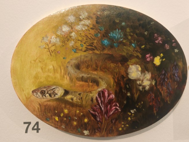
I absolutely fell in love with this picture when I saw it. The snake is lovely, and so beautifully painted. The way in which it blends nicely into the background, with all of the grasses and flowers is masterfully painted. It appears to be cautiously slithering into a bright, open space at the left hand side of the picture space. The flowers here too are beautiful in their arrangement and in the sheer quantity of different species which she has placed within this small scene; each plant adds it’s own little something to the naturalistic feel of the composition. Her manipulation of light is also wonderful, with the dense flowery grass being darker and feeling a little more foreboding than the open space which the snake is entering. This is quite a small panel painting, but it holds a lot in for its diminuitive size.
On Jenni Hawkins website, she shows this very same painting, however it is displayed with another equally small panel of a plum. It has them displayed with the snake low down, but the plum high up, in a bright space, surrounded by light. I feel that this display better represents the painting(s); and that the display with the plum makes the overall feel and viewers interpretation of this painting change completely. It’s no longer about the snake, but feels as though two windows have been cut into a bigger picture, giving two of the tiniest glimpses into a larger scene, leaving a whole expanse of this scene completely to the viewers imagination.
Peter Kull – Daily Walk
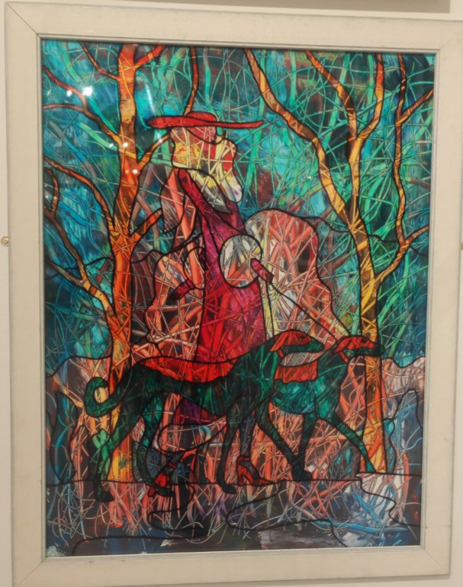
This artwork by Peter Kull is very interesting, on a first walk past I just dismissed it, but when I looked back at it from across the room, it suddenly stood out to me in the exhibition. This picture is quite abstract, yet the central focus of the picture is clearly visible within the apparent kaleidoscopic chaos of the painting. It is titled Daily Walk and the central theme could be little other than what for millions of people is a daily ritual – that of getting dressed for the outdoors and taking their dog for a walk. It’s is a very ubiquitous scene in British culture. Here however, Kull has turned this ordinarily inane act into a very intriguing artwork indeed.
This work is created from Acrylic and Glass Paint and has the presence of a stained glass window. Partially this stained glass effect is created using those thick, powerful, black lines between blocks of colour and to emphasise the edges of objects within the picture, the jewel like colours of the paint also help to complete this impression of stained glass. The lady walking the dogs, dressed in red, has on wholly inappropriate footwear for the event of walking dogs, with her hat, and her fur trimmed coat, she appears better attired for a day at the races. The dogs, they look like racing dogs; big, and lean, they don’t have the apparent heir of domestic pets about them. The red faces and backs are covered like a muzzle and racing jacket that would normally be found on a racetrack. This all leads me to surmise that this picture is not about walking dogs, but enjoying a day off racing.
Julia Chandler – Somewhere in Time
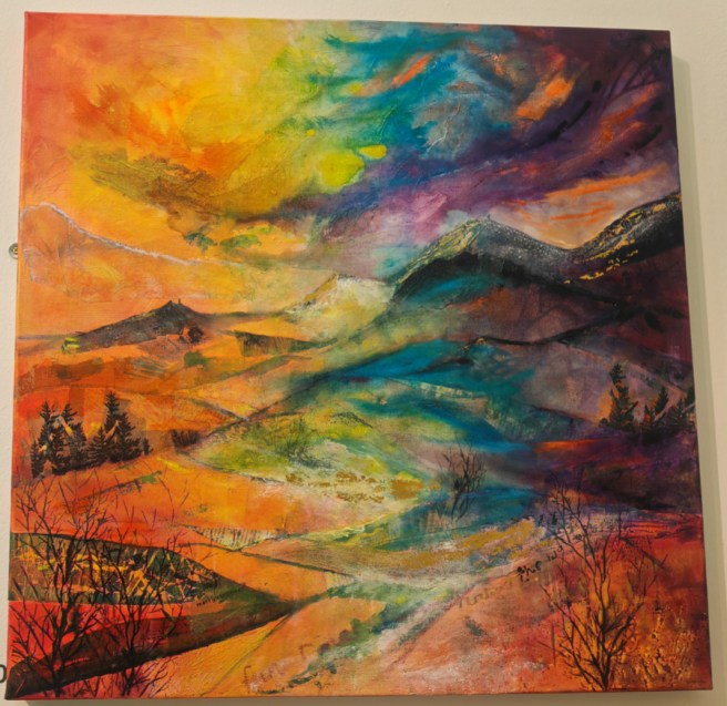
I found this mixed media false colour landscape absolutely fascinating, while this feels abstract, there is a definite recognisable image in here. Julia has created here all of the aspects that you would expect in a landscape, mountains, rolling hills, trees, a good sky, they make the scene recognisable and naturalistic. There is a stark contrast in the tone of the artwork, with the left being bright, warm, feeling welcoming, while the right side is darker, cooler feeling with a foreboding feeling shadow creeping in from that side. This duality of colour continues right through into that wild feeling sky which feels both oppressive, and open at the same time. I personally like the form and scale of this artwork, as well as the attention to detail that has gone into assembling the work.
Lesley Wood – Who Knows Where The Time Goes
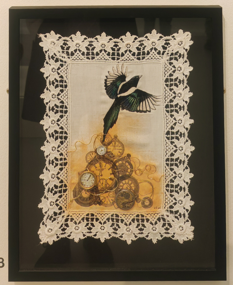
I found this little artwork, which was low down on the wall to be utterly charming. The cloth on which the scene is embroidered has a lovely lace trim border as pasty of itself. The colouring here is fantastic, the duality of a ruddy burnt orange against the white background makes for a fantastic contrast. There are a lot of images of timepieces in this artwork, many of these are printed onto the fabric, but a couple are actual watch faces that have been attached to the artwork to illustrate the depth of this spread of time and how it receded into memory. The golden thread of time weaves around the timepiece images and nicely ties them all together into one unified line of time, though with many different memory moments contained within it.
There is a large magpie flying off, as though trying to escape the picture space, this takes up a good portion of the top half of the image. The embroidery on the magpie is absolutely amazing and so very well done. The tips of the magpie’s wings are just emerging from the edges of the picture space, as though the magpie is representative of time, leaving the scene and flying off into the future. In Irish mythology, a magpie flying away like this is symbolic of a change in time; I wonder what change the artist had which precipitated this. Altogether this is an absolutely stunning artwork which is full of symbolism but also carries the feeling of poignant sadness within.
Alison Diamond – Lazy Sunday
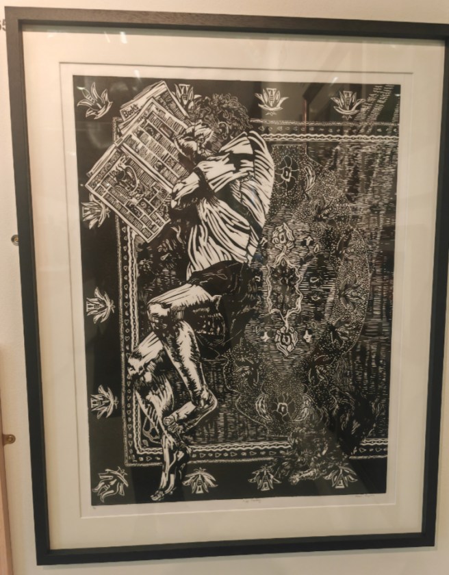
This lino-cut print is absolutely amazing. It’s size, complexity, style and attention to detail are all incredible. The scale of this artwork is large, much bigger than any other linocut print I have ever seen. The quality of the printing is fantastic too, with good sharply delineated lines, very little ink run into spaces where it isn’t meant to be. The only down side to this print from a viewers perspective is that the dog in the lower right of the artwork is that it is difficult to make out, It is dark, against a dark background.
The carpet on which the man is lying has been beautifully rendered with the pattern on the carpet displayed quite clearly. You can see the folds and creases in the man’s shirt, and the fall of light on his legs very nicely. He stands out beautifully against the carpet, propped up as he is, idly reading a newspaper while he lays on the carpet with the dog. This is a fantastically detailed domestic scene of someone just idling away the time, as we used to do before mobile devices became a ubiquitous part of every day life.
To sum up
I have really enjoyed the huge range of artwork which was on display at the exhibition in Woodhorn this year. The artworks that I have picked out this year are mostly in a different artistic style, or medium to that which I am usually attracted to. Every artist who has work in this exhibition should be amazingly proud of themselves, their work, and their achievement, they are all fantastic artworks and all deserve a spotlight.
Links to artists websites (those I could Find)
Lara McFarland
https://www.instagram.com/laramcf_art/
Ruth Craig Murphy
Jane Fitzpatrick
https://www.instagram.com/art_byjanefitzpatrick_/
Sylvia Brown
Amanda Hall Younger
Geoff Hudson
Hannah Forsyth
https://www.forsyth-studio4.com/
https://www.instagram.com/forsyth_studio4/
George Lowrey
Pamela Brown
Jenni Hawkins
https://www.instagram.com/jennihawkins_art/?hl=en
https://jennihawkins.com/works
Jenni Hawkins work exhibited in London https://www.agakhancentre.org.uk/gallery/canticle-of-the-birds/
Peter Kull
Julia Chandler
https://www.instagram.com/julia_british_artist/?hl=en-gb
Julia’s page on Coquetdaale art gallery website
https://www.coquetdalearts.co.uk/julia-chandler
Lesley Wood
https://www.instagram.com/l.wood100/?hl=en-gb
Alison Diamond
https://www.instagram.com/alison._.diamond/?hl=en
https://www.thetinshed.co.uk/artist-studios/alison-diamond-rogers
