
Kirkleatham Museum, Redcar – until June 16th – £2 museum entry
Banfkfield Museum, Halifax 12 Sptember 2026 – 6 March 2027
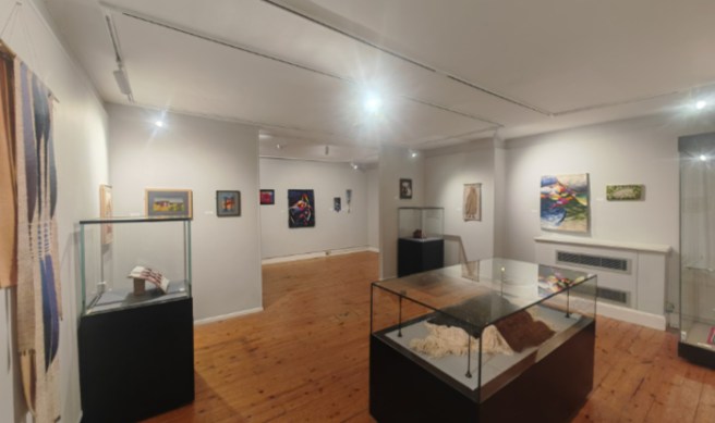
This exhibition ‘Tapestry of the North: Our Textile Heritage’, is a showcase of textile works created by the northern England members of the British Tapestry Group. The lovely Kirkleatham museum in the second of three locations within which this exhibition is being displayed, remaining there until June 16th 2025 when it will move to Halifax Bankfield museum for its final showing. This exhibition is inclusive of multiple differing styles and levels of experience and skill displayed alongside each other. The textiles exhibited within the exhibition showcase not only the skill of the artists who have crafted them, but also the history and industrial heritage of the region. This exhibition was a delight to stumble upon and has engaged my imagination wondering how the artists have even managed to create some of the lovely textiles on displayed here.
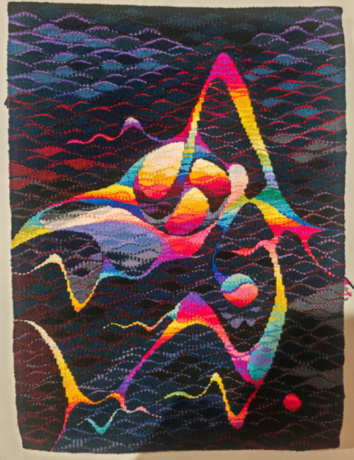
This exhibition though isn’t just about the art of weaving the tapestry itself, but is about creating an image and setting a scene. There are multiple differing types and styles of work on display here, someone which take on more abstract forms. Michael Crompton’s ‘Pollution – Sounds’ is one of these, delightfully whimsical in it’s content, the colours within are a seemingly random pattern, interspersed with waves. Whilst it isn’t labelled as a marine scene, it is quite identifiable as an underwater style image with the larger regions of colour forming abstract fishesque shapes. Whilst I found this interesting to look at, I did notice that it was woven with quite a coarse wool and had a lot of thread hanging from the rear of the panel.
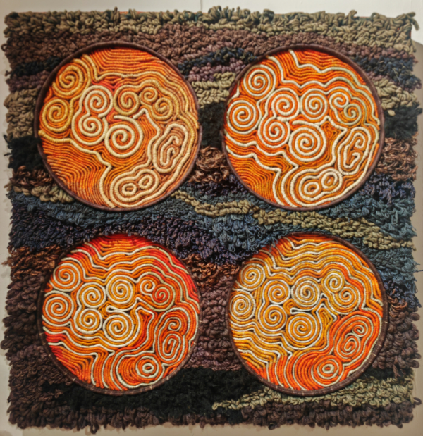
Margaret Crowther’s ‘Chemical Clocks’ is another of those abstract style works, this one created with a quite limited colour palette consisting of oranges, browns, white and very few other colours. The background of the panel has been made with a coarse texture, and quite a thick pile; there are waves of tone throughout as though the weaver has tried to mimic the way in which colours change in stone, or in old wood. There are multiple different textures of wool used here which each add their own texture to the overall fee of the piece. The four circles though are where the real difference is, the patterns and shaped inside of those are a mix of orange white and straw, each of the colours here has it’s own unique texture. The weave here is tighter, with the flow of lines through this part of the work feeling much more rigid and structures than with the background. Overall the effect of this is one of a multitude of structures and textures within quite a small space, it manages to be pleasing to the eye at the same time as reasonably chaotic.
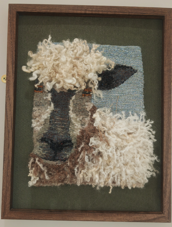
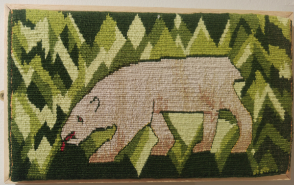
Within the body of work on display are several panels with animals depicted on them, they all have a completely different look, and feel to them, and each manages to convey what it is with style. Margaret Bennet’s ‘Wensleydale Ewe’ is a fabulous pictorial piece where the sheep is rendered with the wool sticking from the weave, giving a nice, realistic three dimensional look, this sheep could feels as though it almost be stood looking through a window, or a hole in a wall at the viewer. The naturalistic-ness of this sheep’s wool is brought into sharp contrast when it’s compared with the weave used by Gwyn Hunt on her tapestry ‘Bear Story’. Hunt’s weave is much tighter and more firm, with each individual stitch adding to the pictorial effect. The rendering of the polar bear, within the forest landscape has been masterfully created for such a diminutive piece; The small scale, with multiple defined colours functions extremely well for conveying this image.
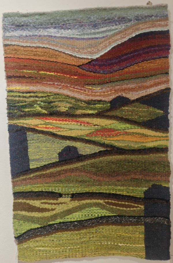
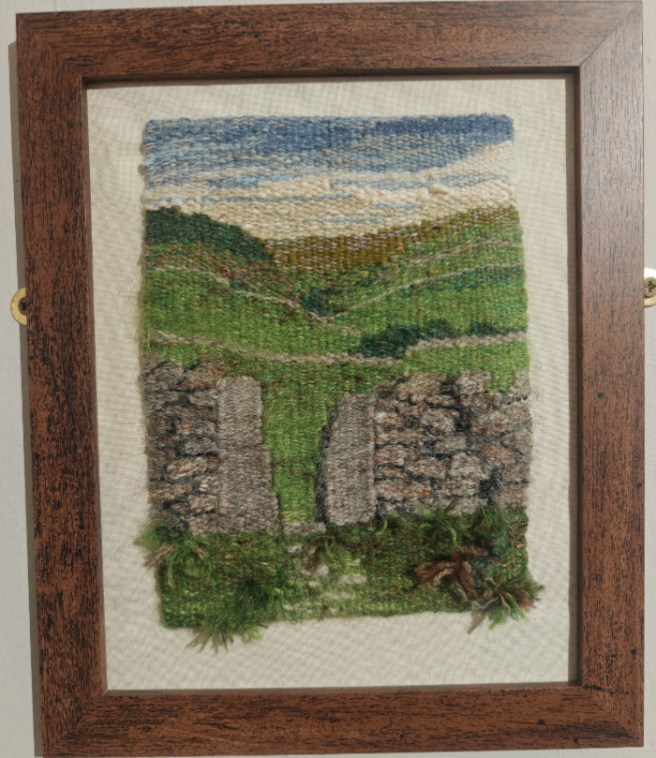
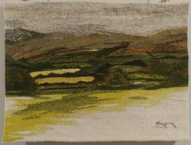
There are several pictorial tapestries of landscapes included in this exhibition, the medium lends itself so uniquely well to creating this specific kind of image. Elizabeth Skuce tapestry ‘Swaledale Barns’ is a fantastic example of this landscape style put into action. She has used different colours and textures to create different landscape features such as fields, walls, and even distant hills. A similar theme can be seen in Margaret bennet’s ‘Squeeze Gap’, where different textual effects are used to great effect, especially on the nearby grass and weeks beside the wall. Anne Wetherell though, in her ‘Howgill Tapestry’ has used an even, flat weave with colour as the main driver of the pictorial recession within the scene. The way in which she has designed the scene makes it appear more like a watercolour painting than the other landscape tapestries. There is a masterful use of greens, browns, and orange which filter gradually into a white which could be the ever present cloud which covers the Howgill fells.
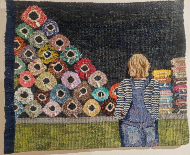
Because of the quite fine nature of tapestry, and the way in which it is constructed, it is a good medium for conveying people to the viewer. In Glynis Johnson’s ‘The cost of Cotton’, she has a nicely realistic feeling woman stood in front of a Market stall containing bolts and rolls of textiles. She has even managed to get the feeling of separation in space between the woman and the stall. Her clothing is constructed of brighter appearing colours and different textures to that of the stall behind, the hair has an amazing texture and looks as though it could be real.
Links
https://www.tapestryofthenorth.org/
Home
https://www.instagram.com/britishtapestrygroup
