
22nd February – 1st June 2025 | Woodhorn Museum | Annual Ticket Charge Applies
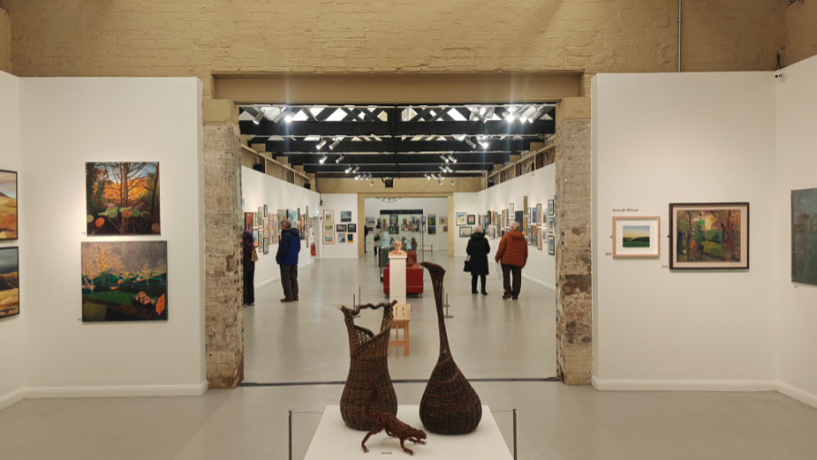
I popped along to the Northumberland Open Exhibition at Woodhorn early in March 2025, soon after the exhibition opened to the public. Unlike previous years offerings, this iteration of the exhibition doesn’t have a theme, the artwork feels much less coherent, slightly more disparate, though the quality of work is every bit as high as it has been in previous years exhibition. I joked that this year felt like a much denser hang than previous years, and as it turned out, the number of works on display was absolutely huge, more than three hundred and fifty!! So many works that it took me over three hours to properly look around and take in the details of them all.
As I began to circulate around the exhibition, I began to notice that there was more abstraction this year than there had been in previous events; some of which have interesting colour mixes and techniques on display. The array of textile-based art also appeared to be on the increase, pictorial collages made from textile and freehand sewing are becoming something which I enjoy looking out for these days! There are castles, ruins, hills, streams, woodland, and moorland on display as well as plenty of home life scenes and images of friendly groups and whimsical little scenes. However, the most striking contract between this year’s exhibition and last year’s was that there were no depictions of the ill-fated Sycamore gap tree; an icon so beloved in Northumberland that last year’s exhibition felt as though it was caught up within the outpouring of grief at the tragedy which befell the solitary sycamore standing vigil along Hadrian’s Wall.
Once again, I am delighted to share in this blog post the works which I personally loved, the ten which for one reason or another spoke to me. It was incredibly hard to decide on my absolute favourite pieces from this exhibition, and I will probably change my mind on which works I find appeal to me on my subsequent visits to the exhibition before it closes.
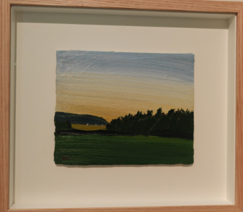
The artwork selected by the panel of judges as the overall winner of the Northumberland Open Exhibition 2025 is intriguing. It is the kind of artwork which I normally wouldn’t even not notice. It has a good tonal range within its composition, but this appears to make up for the muted colours with browns, dark greens and ochres dominating the image. While it is a good representation of late in a sunset scene, the brush lines add an unrequired texture and in my personal opinion detract from the artwork as a whole. Despite this, the clarity of the scene itself comes across well.
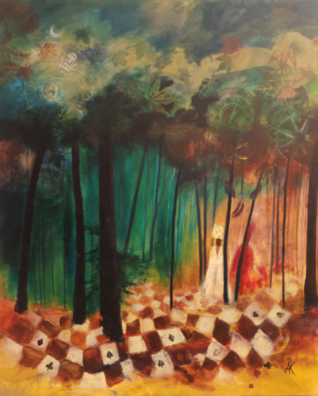
As soon as I saw Annie Kennerley’s artwork Finding the Way I just fell in love with its interesting composition and subject matter. The first things which struck me about this piece of work were the semi ethereal figures walking out from the woodland at the head of an indistinct procession of some sort. The two figures with their interestingly styled dresses and hats look almost tribal, as though they are an orientalised vision of how processing through the woodland should look, that is until you look closer and realise that her hat contains the four suits from a deck of playing cards. These four symbols, also reappearing on the ground which they are walking along opens out the floor of the forest as almost a game space, or a place which doesn’t appear to be a part of the natural world.
The graduation of the colours in this artwork, from ruddy ochres in the sky, through the green of the forest and even onto the orange-yellow dirt distract the eye from the carefully printed details which are hiding in the upper reaches of the forest. The leaf prints, time symbols and zodiac wheel all build on the other iconography within this beautiful work to direct the viewer into seeing this as associated with either latent paganism, or the story of Alice in Wonderland – The moon above the zodiac wheel even looks a little like the grin of a hiding Cheshire Cat! This picture is a literal work of art which the more you look at it, it becomes more multifaceted and could tell more than one story to different viewers.
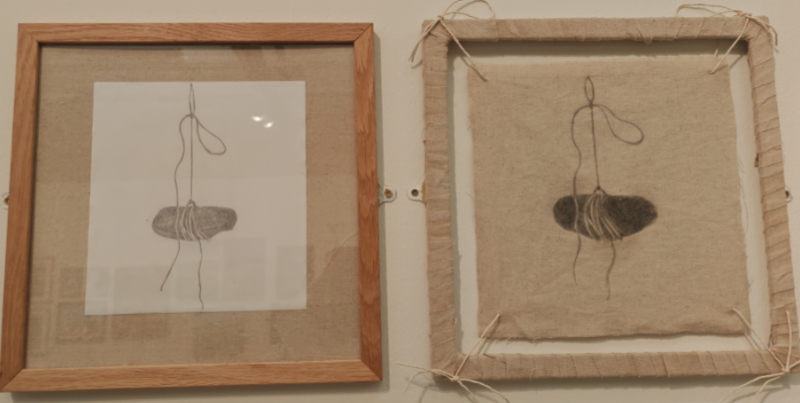
As I came to Margaret Adams two artworks, displayed side by side on the wall, I was taken immediately by the sense of whimsy which I felt they embodied. The two images of rocks are subtly enough different that they could be two separate rocks, but they could also be the same one, just reproduced in different media. I adore how the delicate coils of the string, and the knots have been faithfully reproduced on both images, giving us a sense that there really is somewhere out there a captive rock being held somewhere waiting to have its portrait drawn. The framing of the second picture however is a stroke of genius, the frame is wrapped with linen, just as the artwork has been created on lines, but the method of attaching the work to the frame, using the same string which would have held the rock, that in itself is real art in itself and should be acknowledged as such.
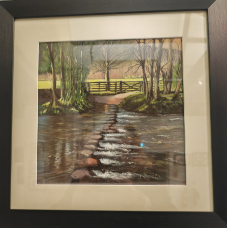
This delightful little scene by Catharien Hilkins comes across as an idyllic little British scene, one that plausibly may not have changed in generations. Sets of stepping stones are a relatively common feature on shallow rivers of Northern England, their appearance sometimes looks rough, sometimes naturalistic, almost as though they are a constituent part of the environment. Wherever they are situated, they often create a picturesque and idyllic scene in the eyes of the observer.
The straightness of the boundary fence, and of the tree line across the field on the other side of the river sit in a jarring juxtaposition to the less straight line of stepping stones. It appears as though this may be a winter scene as the trees are bare and lifeless looking. The flow of the water as it overtops the stones has been beautifully caught here in a manner which I would have though difficult to master with pastels, yet Hilkins has accomplished this masterfully. The flow of the water, and the colours of the river bed refracting from below look natural, giving the entire scene an enchanting look.
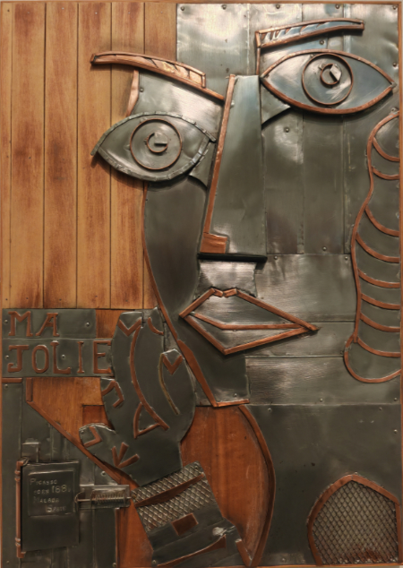
Picasso Tribute by Michael Rigg caught me by surprise, while I had already seen some abstract art within the exhibition, I hadn’t yet come across something as complex, or readily identifiable as this piece of artwork is. The facial features and composition reference Picasso’s work exceedingly well while the text ’Ma Jolie’ directly references one of his most famous experiments in cubic abstraction from relatively early on in his career as an artist. In the corner, there is what looks to be a little sculpted book inscribed with Picasso, Born 1881, Malaga, Spain; the book however was closed with a small latch, it would be interesting to see if the artist had placed anything of relevance within this, or left it empty.
The facial features of the character within this sculpture, the locations of the eyes on the face, even the angle of the head are all taken from iconic parts of Picasso’s different compositions. The construction material for this piece is also unusual, copper and brass often don’t sit together so easily, and the entire assemblage, placed as it is on a background of wood give the appearance of a more period piece than modern sculpture. The background of the piece itself looks quite similar in tone to that wood panelling that adorned a lot of homes during the 1970’s. This gem of an artwork gives an entirely new spin on Picasso’s work, blurring the lines a little more between painting and sculpture and art as tribute.
Jean Coldwell’s artwork here is showing off a lovely piece of period folly building which was created by a land owner who decided to build a hunting lodge up on Rothley crags. The framing of the view through the window is of course a fiction as this view of Simonside is from a different angle altogether. The foreground of this painting having such a meagre display of colour on the face of the castle stones stands in complete contrast to the view through the window, which is far less bleak, much more colourful and very iconic. The composition of this image, with the map centred over Rothley as it is, means that the top upward part of the faux arrow slit window actually forms an arrow on the map pointing directly north to where these hills are situated in relation to the castle itself. This is a really well thought out and interesting piece of work which encourages the viewer to interact with it in various different manners, each revealing something new about the artwork.
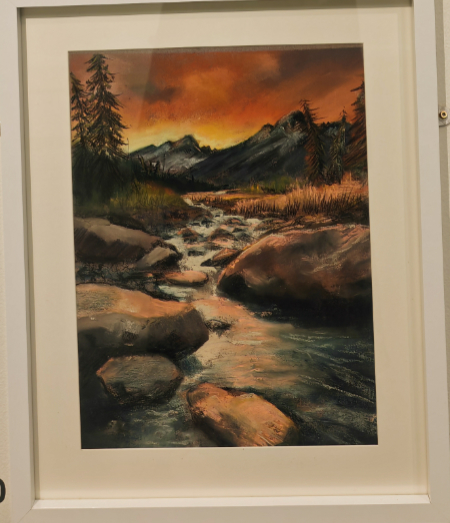
I have included Heather Howarth’s Tumbling Stream into this list as the red colours contained within the sky here really translate well into moody, ruddy colours throughout the rest of her composition. The location of this little valley isn’t given by the artist, but it could represent any number of different valleys anywhere. The feeling which this pastel work most evokes is that of calm tranquillity, the same feeling one gets from sitting in a small glade just watching nature as the day trickles by. There is a timeless ethereal quality to this work as it is difficult to tell from the vibrancy of the colours whether this is morning or night, with the indeterminate nature bringing forth a mix of different feelings and excitement as the imagined scene plays out in your mind.
The way in which her artwork is composed is nicely balanced, the mountains don’t loom and aren’t overly tall, the angle of the stream isn’t too steep for the bubbling trickle which it contains. The artist herself appears to have followed the rule of thirds, with lines going up the side of the stream and along the join of hills and grassland being quite rigid. Despite this the whole piece flows nicely and gives a glowing warm sense of a quiet yet idyllic evening.
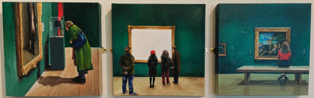
Elizabeth Roberts triptych of people in an art gallery caught my attention as it highlighted what I was doing at the precise moment. This meant that I could easily identify with the content of this artwork and was able to examine it based on how I would imagine myself to fit into the scene. Each of the different behaviours which the artist has included into her three images is something which I personally have done whilst viewing this exhibition.
As seen in the first of these pictures, craning in for a closer look is I think just standard exhibition behaviour, even when there is space to move closer to an artwork you often down want to crowd it as you take in the details. Standing back, as in the centre image is another good way to get to know an artwork, not only do you have a good overview of the work from behind, but listening in to others discussing artworks is a good way to learn more about them, or at least to learn what others value in that particular work. Lastly, sitting and observing; this is something which I personally enjoy doing in a gallery, so to see this behaviour highlighted in this way was lovely. This little group of artworks really do a good job at showing the viewer that they are also being viewed.
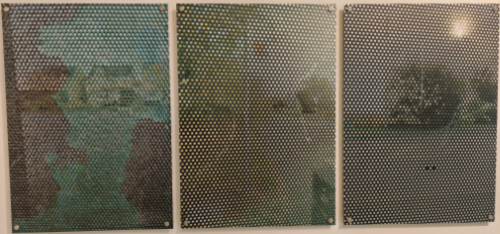
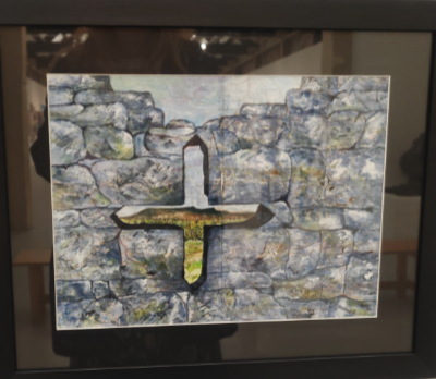
The title suggests that this may be a religious piece of artwork, however, that depends on how one defines religious art and what Is or isn’t a religious view. One thing that this composition does have in common with many religious works is that the subject matter is somewhat obscure and partially unreadable. The use of construction of the shelter to partially obscure the detail behind references nicely the way in which religion shrouds the meaning of what is presented to our view.
The material which the bus shelter is made from has an interesting texture in the first panel of this triptych thank to the way in which the paint has flaked away, this pattern interacts in an odd way with the view behind it of the houses. The other panels contain trees and a scene which is more obscure, the small holes in the surface texture force you to step back and try to make sense of the pieces of image from behind which you can see. This is altogether a very dynamic piece which works with the eyes and the brain to help piece together the meaning of the image.

I really like this kind of artwork; it takes some serious skill to take differing fabrics and stitches and combine these to create a beautiful picture. In this case, Donna Cheshire has created a wonderful little masterpiece. She has used hard lines to delineate between different areas within the pictorial scene; with different softer stitching and more complex longer stitching to create what appear to be hedges and grasses throughout the image.
The use of different, similar and contradictory colours works well in delineating parts of the landscape so that it becomes less a mas of green and more an organic interweaving of different patches of natural shade. Judging what is close by and distant is quite easy in this artwork, with those hills being believably quite a distance off. The darker edge of the top of the hills is nicely mirrored in the bases of those clouds which look as though they could be a little gloomy. The technique used here is absolutely amazing.
This was by far the cutest piece of artwork on display, the three sculpted red squirrels were rendered in such a beautifully animated and lifelike fashion. They were attached to a piece of wood, running up the wall as though it was the side of a tree, and they were playing with each other. This was possibly my favourite piece just because of the whimsicality of it.
Final Thoughts.
Overall, I feel that the organisers of this exhibition at Woodhorn have done a beautiful job of not only choosing what to include, but also in how they have integrated all of the different styles into a coherent exhibition which doesn’t lean too heavily on a particular medium, or type of art. The skill level of the art on display is exemplary with many beautifully finished artworks all hanging side by side just waiting for the viewer to investigate them.

I have been to that exhibition and there are some amazing pouieces. My favourite was a difficult choice but I remember a large glass artwork and the painting of a river flowing which looked so life like. Of youre choices, I was amused by the squirrels, and the Newbiggen Altar Piece was interesting becausde of its sizxe and as you moved further away you saw more. It would be a fabulous piece in a large lounge orin the atrium of an office building perhaps. I did like I Spy Simonside as Ive actually been to that site and recognisedv it immediately. However I never really noticed Finding The Way and I was amazed at some of the features you described. A fabulous review once again. (I wonder if I go back will that glass cat have been sold yet?)
LikeLike
Im glad that you enjoyed the exhibition there as much as I did
LikeLike