18th September 2026 – 4th October 2026
£5 – Includes a drink and cake.
I’d never heard of Shambellie House before, so when a quilt exhibition there came to my attention, I was quite intrigued. Shambellie’s location at New Abbey, near Dumfries, is a little out of the way; however, the trip was well worth it. The house itself is a mid-Victorian mansion with some interesting architectural detail; it has previously housed the National Costume Museum (Scottish) and these days is run by a local trust as an arts and creative hub, with links to the local community, and trying to encourage creative tourism in the area.
Quilting is a very interesting art form, which has changed dramatically in recent decades; these days it is as much about artistic expression as it is about design and utilitarian craft. Seeing the changes taking place within the quilting world from the outside, I am constantly awed at both the level of technical skill and the sheer volume and difference in artistic expression between not only individual quilters, but groups of quilters too. This year is the sixth annual quilt festival that is being held at Shambellie House, containing around 500 different quilts, and the first which I have attended there.
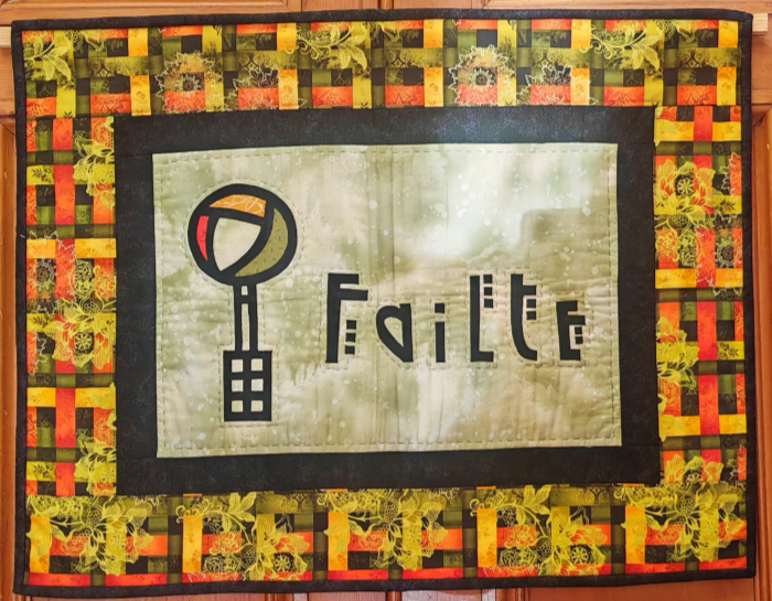
The exhibition felt very welcoming, with a welcome quilt on the outside of the entrance door exclaiming “Failte” to all those who arrive; once inside, the volunteers and staff on hand were extremely friendly and knowledgeable, giving good direction around the exhibition. The exhibition itself took up the entire house, with quilts covering just about every wall in the building; in places, the effect of this was quite overwhelming. There was some interesting collaboration with the wider community, and a small selection of mini quilts produced by children at a nearby school were grouped together in one of the rooms as part of the exhibition.
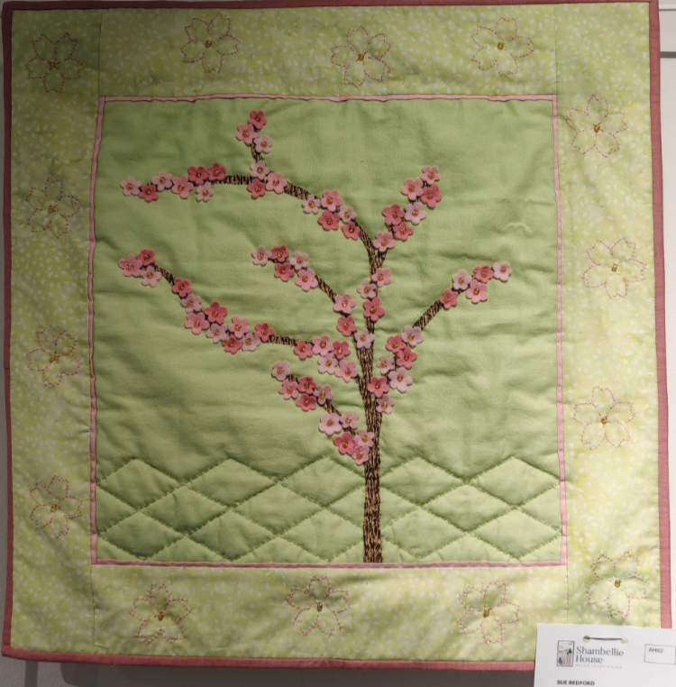
The exhibition this year included a Japanese theme; there was even a whole room of quilts which referenced Japan, or had a direct Japanese theme. There were several pieces which I really liked in this room; I found Sue Bedford’s Cherry Blossom Tree to be quite delightful and elegant, though small. I quite liked the limited colour palette used with just a couple of complementary colours; the offset tree against the diamond patterning of the lower background gives a good impression of a tree standing out in the foreground with distant hills. The cherry blossom appliqué is applied in just the right quantity to create a pleasing display, while the flowers stitched into the generously sized border nicely reference this detail to create a cohesive work of art.
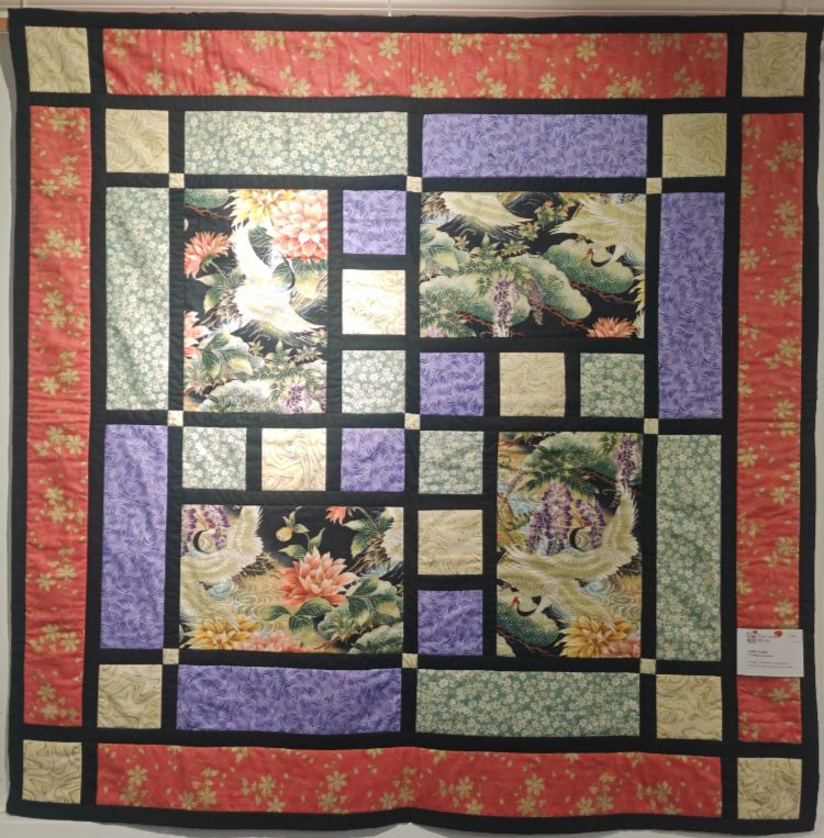
A Gallery of Cranes, by Carol Nisbet, also really stood out to me in this room; it was one of a couple of quilts which were of a larger scale and contained inset panels of pictorial fabric. I like this one for its simplicity of appearance and the balance that the four quarters of the quilt give to the overall composition. The black dividing lines, with the inset colour patterns, at first appear very Mondrianesque, though they lack the irregularity of his compositions. The patterns of all the fabric work well together here, with the four main block colours complementing each other, and the colouring within the pictorial parts nicely; there is a definite balance to the colours here. The four crane panels, though they are just exquisite; they look as though they have been taken straight out of a Japanese painting, each of them cut and oriented to show off not just the frame, but the detailing within the wider scene too. Most of the stitching here appears to be done on the black strips, which has left a very clean-feeling finish.
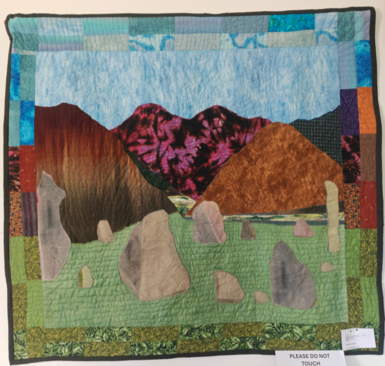
One of my favourite quilts of this entire exhibition is the Cumbrian Stone Circle, created by Bridget Barling; this delightful quilt really made me smile. The way in which she has constructed the stones, using a fabric which has more than one tone, is an interesting way to create the effects of light and shade on the rocks themselves, while at the same time, the horizontal quilting lines really help to emphasise distance across the ‘field’; thus setting the stones into a circle. The green grass contrasts nicely with the lighter colours used to create a valley floor in the distance below. A similar effect can also be ascertained in the mountains, where colour, shading, pattern difference and light have been utilised to great effect to make the recession into the picture space appear more pronounced.
The different quilting patterns and lines on the mountainsides help to distinguish different parts of the picture from one another also. The fact that the colouring in the border references the colour scheme in the main part of the quilt is also a nice touch, though there are an extra couple of bits of colour and pattern sneaking in there. This quilt has a lot of charm and character.
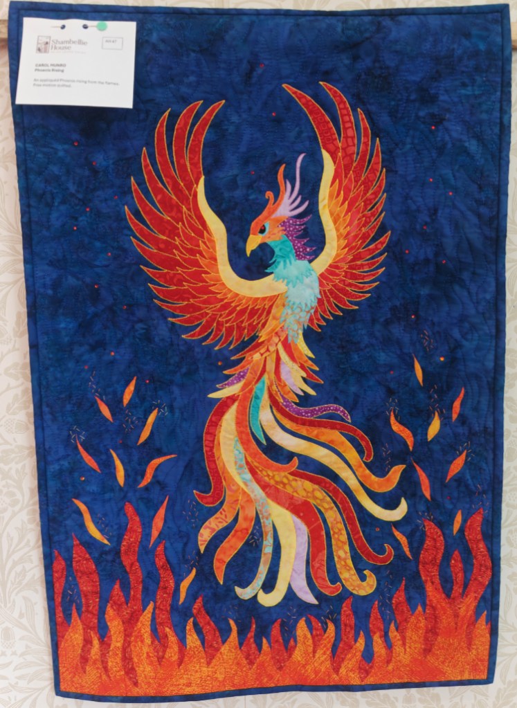
This absolutely beautiful quilt shone out to me from the wall where it was hanging. The colours of the fabric which have been used here are bright, vibrant and deep. The superimposition of the brightly coloured phoenix over that rich, deep blue cloth creates a vibrant clash of colours. The complexity of this appliqué pattern, combined with the multitude of different colours and patterns in the bird itself, and also the flames of the fire, really goes well together. The use of the same colouration on the underside of the wings as the phoenix rises in the flames is a nice touch. The freehand quilting of the background also has a good regularity and appears to have similar shapes to that of the flames below; this is a very nice touch.
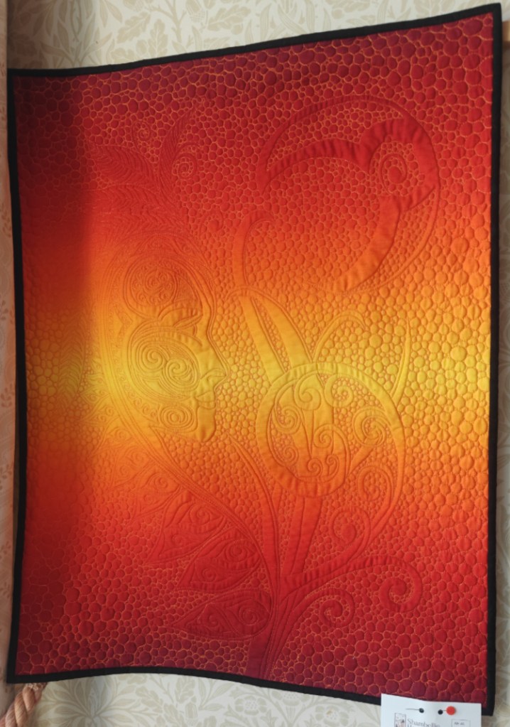
One last quilt I wish to discuss here is Carol Munro’s ‘Spirit Maiden’; there were several things in this amazing composition which caught my attention. This quilt is made from a multi-tonal fabric, which has a bright stripe across the middle; I feel that this emphasises the central part of the pattern and gives it far more emphasis than the top and bottom portions. The detailing in the face, plants, leaves and all of the other goings-on in this quilt are a part of the quilting pattern itself, rather than appliqué, or any other technique that could be used to achieve a similar look. The pattern itself is very complex; it must have taken the artist quite a time to mark out where each aspect of the pattern would lie before sewing.
The act of sewing this piece has created a lot of texture which is visible on the surface of this quilt; in places this texture catches the light, emphasising the pattern and artwork within. In a near monochromatic work such as this, that extra texture feels as though it adds extra depth. The most striking thing for me, though it that the threads used to sew the quilting appear to alternate between a light and dark thread so that it sits in opposition to the background colour itself. This is a beautiful touch, and really demonstrates a wealth of skill and technique used by the creator.
This exhibition of quilting at Shambellie House was a real delight to see; there were so many nice pieces on display that I had a difficult time picking the ones that really spoke to me in some way. Hopefully I shall be back in future to look in amazement at next year’s exhibition too.


